Visualizing Hotel Earnings Data using Dash and Shiny
Published Mar 9, 2024 by Michael Grogan
Being able to create effective dashboards for data visualization has become an increasingly important part of good data science - allowing a non-technical user to manipulate data in an intuitive way really allows us to yield full advantage of visualization techniques.
Additionally, such visualization techniques can be quite useful when it comes to analysing key KPI data across numerous industries, as this can allow for stakeholders to more easily understand the business implications behind the numbers.
Dash and Shiny are two major frameworks that are used to create interactive data applications. Dash is a major framework in Python that is built on top of Plotly, while Shiny is an open source package that belongs to R.
In my opinion, the differences between Dash and Shiny are somewhat similar to that of the differences between Python and R in their own right.
For instance, making a dropdown menu in Dash can be somewhat more complex than in Shiny - the former requires designing a callback function that can accept multiple inputs whereas using reactive expressions in Shiny is relatively more straightforward.
However, using Dash also means being able to visualize more complex machine learning models generated in Python that may not be feasible in R.
Context
In this example, we will use both Dash and Shiny to visualize publicly released earnings data for two major hotels: Hilton Worldwide Holdings and InterContinental Hotels Group.
Specifically, we will design an interactive bubble chart using plotly to visualize brand performance across key metrics for this industry, including ADR (average daily rate), occupancy, and number of rooms.
Dash
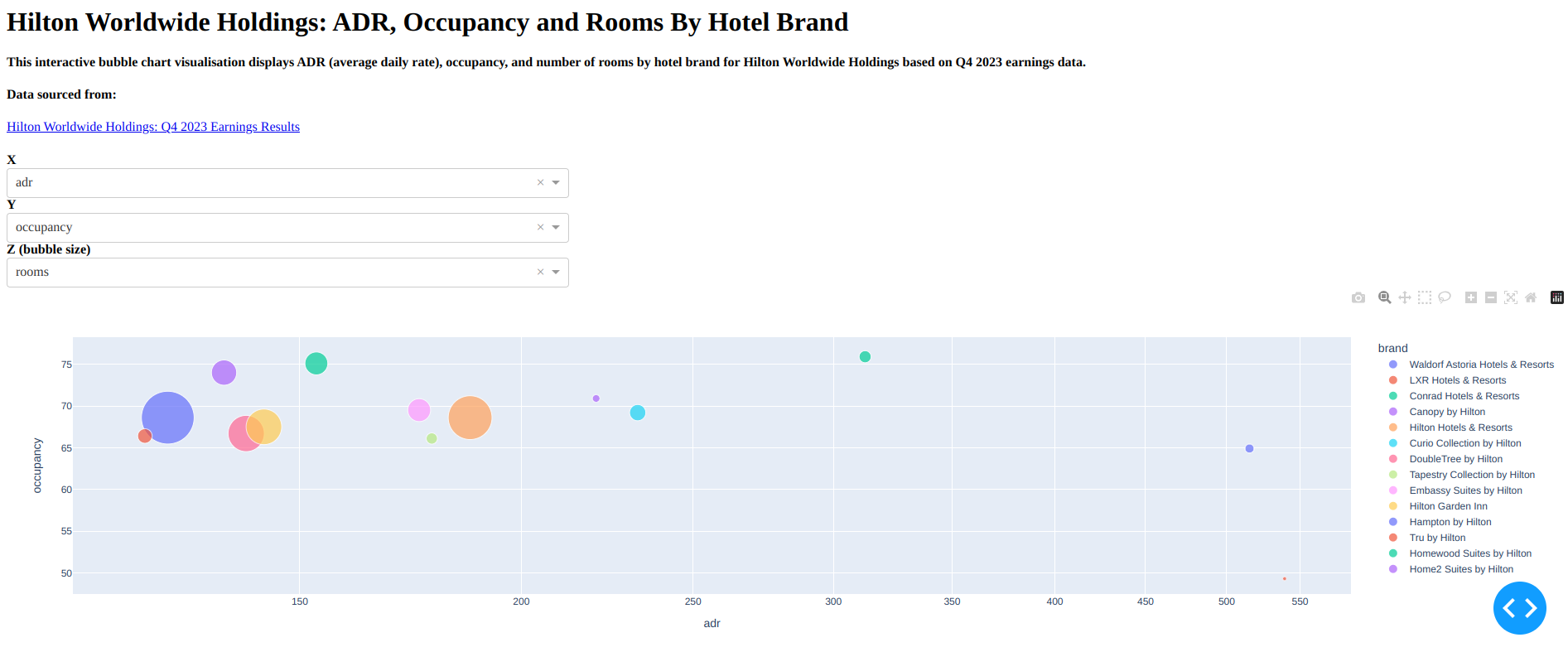
Using plotly, a bubble chart is created to visualize ADR, occupancy and number of rooms by hotel brands for Hilton Worldwide Holdings.
The purpose of using Dash is to create a dashboard with dropdown menus that can allow the end user to set the axis for each metric dynamically.
For instance, we might choose to display ADR on the x-axis, occupancy on the y-axis, while representing number of rooms by bubble size.

Alternatively, we might want to let ADR be represented by bubble size, while setting rooms on the x-axis and occupancy on the y-axis.

Let’s import the relevant libraries and create the application:
# Import libraries

import pandas as pd
import plotly.express as px
import dash
from dash import dcc
from dash import html
from dash.dependencies import Input, Output

# Create the Dash app
app = dash.Dash(__name__)
server = app.server
We will also define the dataframe that we want to call on when generating the visualization:
# Data
d = {'adr': [515.05,539.07,312.61,220.43,187.14,232.65,139.91,178.06,175.16,143.17,126.36,122.66,153.26,135.94], 'rooms': [9840,1774,16950,6940,226015,31000,154708,14719,61844,149130,327690,24755,61624,75069], 'occupancy': [64.9,49.3,75.9,70.9,68.6,69.2,66.7,66.1,69.5,67.5,68.6,66.4,75.1,74.0], 'brand': ['Waldorf Astoria Hotels & Resorts', 'LXR Hotels & Resorts', 'Conrad Hotels & Resorts', 'Canopy by Hilton', 'Hilton Hotels & Resorts', 'Curio Collection by Hilton', 'DoubleTree by Hilton', 'Tapestry Collection by Hilton', 'Embassy Suites by Hilton', 'Hilton Garden Inn', 'Hampton by Hilton', 'Tru by Hilton', 'Homewood Suites by Hilton', 'Home2 Suites by Hilton']}
df = pd.DataFrame(data=d)
Now, we are going to define the dashboard layout. Specifically, we would like to display:
A title
A description of our application and what it does
A link to the original earnings report
Dropdown menus to select the appropriate variables
# Define dashboard layout
app.layout = html.Div(children=[
    html.H1(children='Hilton Worldwide Holdings: ADR, Occupancy and Rooms By Hotel Brand', style={'text-align': 'left'}),
    html.H4(children='', style={'text-align': 'left'}),
    html.H4(children='This interactive bubble chart visualisation displays ADR (average daily rate), occupancy, and number of rooms by hotel brand for Hilton Worldwide Holdings based on Q4 2023 earnings data.', style={'text-align': 'left'}),
    html.H4(children='', style={'text-align': 'left'}),
    html.H4(children='Data sourced from:', style={'text-align': 'left'}),
    html.A(children='Hilton Worldwide Holdings: Q4 2023 Earnings Results', href='https://ir.hilton.com/~/media/Files/H/Hilton-Worldwide-IR-V3/quarterly-results/2024/q4-2023-earnings-release.pdf', style={'text-align': 'left'}),
    html.H4(children='', style={'text-align': 'left'}),

    html.Div([
        html.Label(['X'],style={'font-weight': 'bold'}),
        dcc.Dropdown(
            id='x',
            options=[
                {'label': 'adr', 'value': 'adr'},
                {'label': 'occupancy', 'value': 'occupancy'},
                {'label': 'rooms', 'value': 'rooms'},
                    ],
            value='adr',
            style={"width": "60%"}),
        html.Label(['Y'],style={'font-weight': 'bold'}),
        dcc.Dropdown(
            id='y',
            options=[
                {'label': 'adr', 'value': 'adr'},
                {'label': 'occupancy', 'value': 'occupancy'},
                {'label': 'rooms', 'value': 'rooms'},
                    ],
            value='adr',
            style={"width": "60%"}),
        html.Label(['Z (bubble size)'],style={'font-weight': 'bold'}),
        dcc.Dropdown(
            id='z',
            options=[
                {'label': 'adr', 'value': 'adr'},
                {'label': 'occupancy', 'value': 'occupancy'},
                {'label': 'rooms', 'value': 'rooms'},
                    ],
            value='adr',
            style={"width": "60%"}),

    html.Div(dcc.Graph(id='graph')),
        ]),

])
We have now created a dashboard with three separate dropdown menus to manipulate the bubble chart that will be created using plotly.
To make our visualization reactive, we now need to create what is called a callback function. A callback function is one that passes an argument to another function. In other words, we need the function to pass the value selected in the dropdown menu to the bubble chart created using plotly.
The callback function and the function to create the bubble chart are defined:
# Define callback
@app.callback(
    dash.dependencies.Output('graph', 'figure'),
    [dash.dependencies.Input('x', 'value'),
     dash.dependencies.Input('y', 'value'),
     dash.dependencies.Input('z', 'value')]
)
def select_graph(x, y, z):
        fig = px.scatter(df, x=x, y=y, color="brand", size=z, size_max=45, log_x=True)
        return fig

if __name__ == '__main__':
    app.run_server(debug=True)
After completing the above steps, we can now generate the dashboard and select the appropriate values (click to enlarge):
The full code for generating the above visualization can be found here.
Shiny
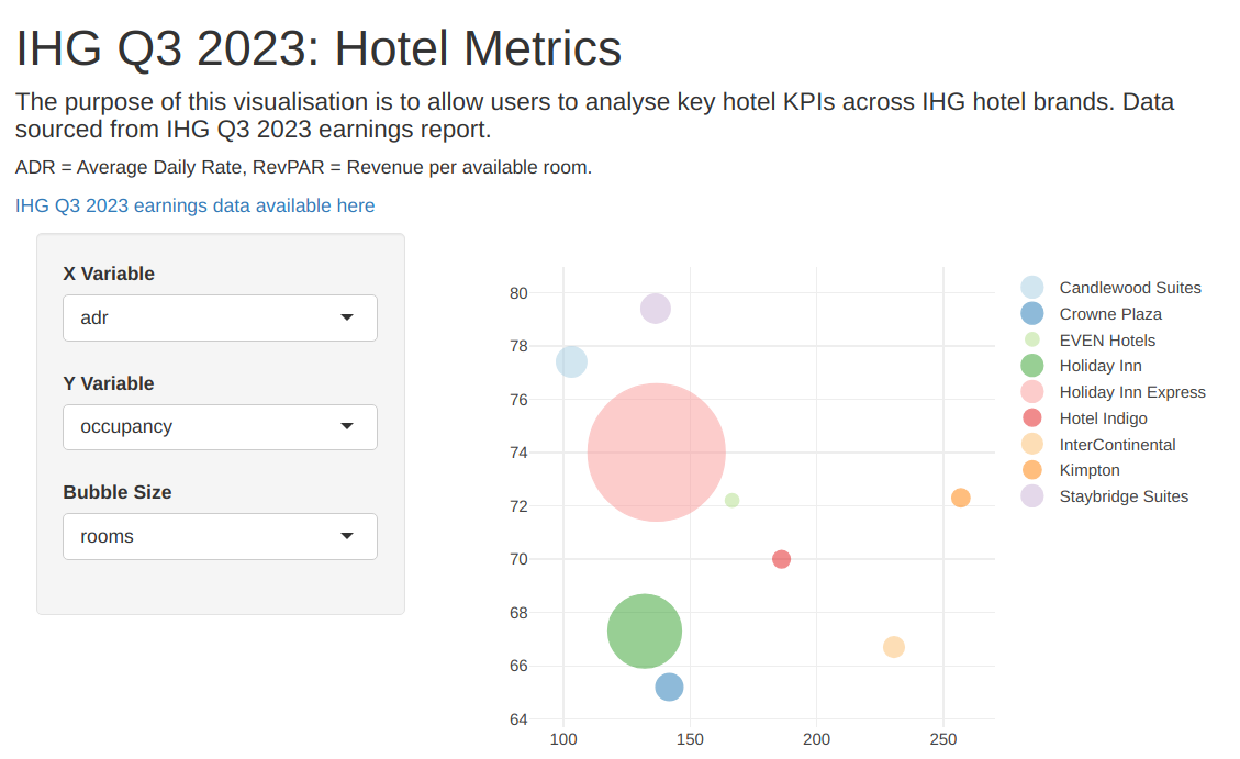
Now, let us generate a visualization similar to the above, but this time using Shiny. We will use earnings data for InterContinental Hotels Group to create the visualization. Our goal is to generate the below bubble chart using the collated earnings data:

Firstly, we shall import the relevant libraries and create a data frame:
library(shiny)
library(plotly)

brand<-c("InterContinental","Kimpton","Hotel Indigo","Crowne Plaza","EVEN Hotels","Holiday Inn Express","Holiday Inn","Staybridge Suites","Candlewood Suites")
adr<-c(230.53,256.93,186.12,141.82,166.60,136.76,132.08,136.38,103.21)
revpar<-c(153.69,185.64,130.36,92.46,120.28,101.24,88.93,108.32,79.84)
occupancy<-c(66.7,72.3,70.0,65.2,72.2,74.0,67.3,79.4,77.4)
rooms<-c(15694,10886,9685,27392,2744,227533,111835,31225,33156)
data<-data.frame(revpar,adr,occupancy,rooms)
When using Shiny, we need to create both a user interface and a server which interact in order to create the application.
Let us firstly design the user interface of our Shiny application. Similar to the manner in which we designed the Dash application, we would like our dashboard to display:
A title
A description of our application and what it does
A link to the original earnings report
Dropdown menus to select the appropriate variables
We can implement this as follows:
ui <- fluidPage(
  h1('IHG Q3 2023: Hotel Metrics'),
  h4('The purpose of this visualisation is to allow users to analyse key hotel KPIs across IHG hotel brands. Data sourced from IHG Q3 2023 earnings report.'),
  h5('ADR = Average Daily Rate, RevPAR = Revenue per available room.'),
  a("IHG Q3 2023 earnings data available here", href="https://www.ihgplc.com/~/media/Files/I/Ihg-Plc/investors/results/2023/q3-2023/ihg-q3-trading-update-2023-supplementary-information-v2.pdf"),
  h5(''),
  sidebarPanel(
    selectInput('xcol','X Variable', names(data)),
    selectInput('ycol','Y Variable', names(data)),
    selectInput('sizecol','Bubble Size', names(data)),
    selected = names(data)[[2]]),
  mainPanel(
    plotlyOutput('plot')
  )
)
In the above, we have created a dashboard with appropriate titles, dropdown menus, and instructed the UI to display the plot generated by plotly.
Now, we will create the server. This is where we define our reactive variables in the dropdown menus - i.e. instruct the plot_ly graph to assume the variables that are specified in those menus and modify the bubble chart accordingly.
server <- function(input, output) {

  x <- reactive({
    data[,input$xcol]
  })

  y <- reactive({
    data[,input$ycol]
  })

  size <- reactive({
    data[,input$sizecol]
  })


  output$plot <- renderPlotly(
  p <- plot_ly(
    x = x(),
    y = y(),
    type = 'scatter',
    mode = 'markers',
    size = size(),
    color = ~brand,
    colors = 'Paired',
    marker = list(opacity = 0.5, sizemode = 'diameter')))
}
Upon creating the server, we now create the app itself using both the ui and server elements:
shinyApp(ui,server)Now, we can publish our newly created application to generate the below (click to enlarge):
The full code for generating the above visualization can be found here.
Conclusion
In this article, you have seen how to create a bubble chart visualization using plotly, and then deploy this visualization as a reactive web application using both Dash and Shiny.
Many thanks for reading, and you can find the code materials as well as other relevant references below.

